Let's create Squid Game symbols in CSS
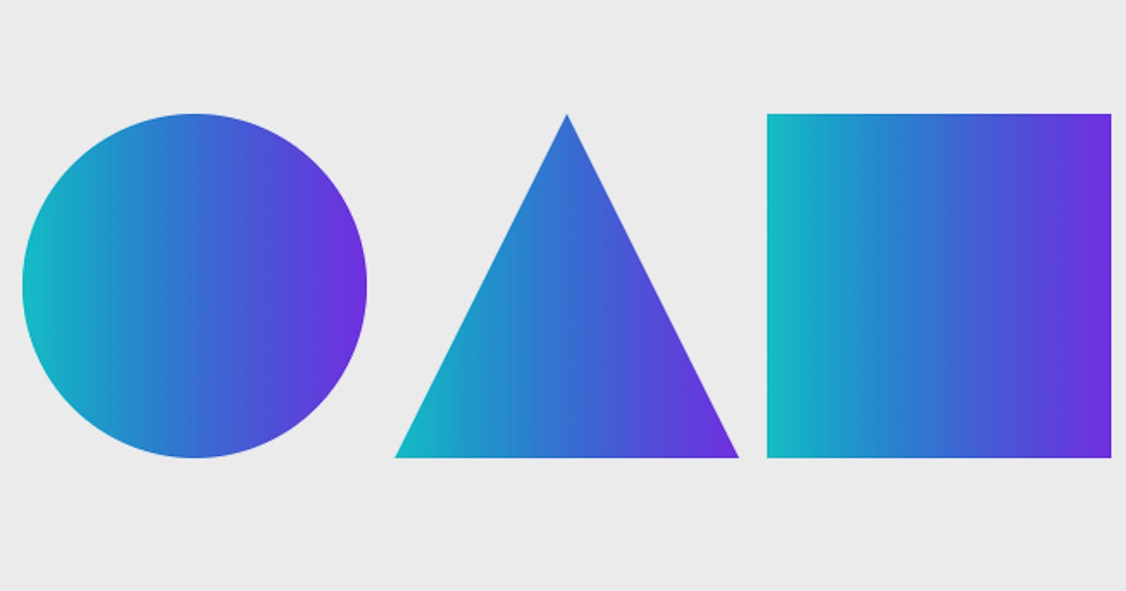
The chronicles of Squid Game: The Circle, the triangle and the square.


Squid Game just became the biggest ever launch series on Netflix. On that note, I thought let's create the viral squid game symbols in CSS.
Yeah! Yeah! I know we are just creating a square, a circle, and a square. But wrapping old things into a new wrapper gives it a fresh look, isn't it? :D
We will have to give the body tag to have full width and height as per the viewport. So first of all we will select the body tag in CSS and give it width and height.
HTML
<body></body>
CSS
body {
  width: 100vw;
  height: 100vh;
  background: #eee;
}
And create a div tag with a class container so that we can contain all the three symbols into that container and place them in the center of the page.
HTML
<body>
  <div class="container"></div>
</body>
CSS
.container {
  width: 100%;
  height: 100%;
  display: flex;
  justify-content: 'center';
  align-items: 'center'
}
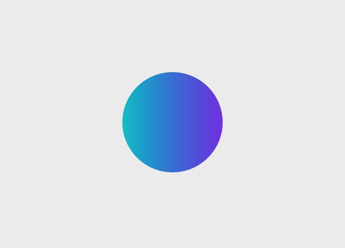
Circle
The circle has the same CSS properties as the square. The only difference is that you give it a border-radius so that it can give it the curve that you need on the border side of the box. To create a circle we need the radius to be at 50% of the current shape so that it can curve to look exactly like a circle.
HTML
<body>
  <div class="container">
    <div id="circle"></div>
  </div>
</body>
CSS
#circle{
  width:  200px;
  height:  200px;
  border-radius: 50%;
  background: linear-gradient(90deg,#00c4cc,#7d2ae8);
}
Triangle
Creating complex shapes has never been easier. Introducing the clip-path CSS property through which you can create a lot of shapes very easily. Compared to earlier CSS hack where we need to workaround borders to get on the perfect triangle. Now we can leverage the modern CSS to write clip-path: polygon(50% 0%, 0% 100%, 100% 100%) to create a triangle that we need and adding the theme as the background which is following through the squid game.
HTML
<body>
  <div class="container">
    <div id="triangle"></div>
  </div>
</body>
CSS
#triangle {
  width: 200px;
  height: 200px;
  background: linear-gradient(90deg,#00c4cc,#7d2ae8);
  clip-path: polygon(50% 0%, 0% 100%, 100% 100%);
}

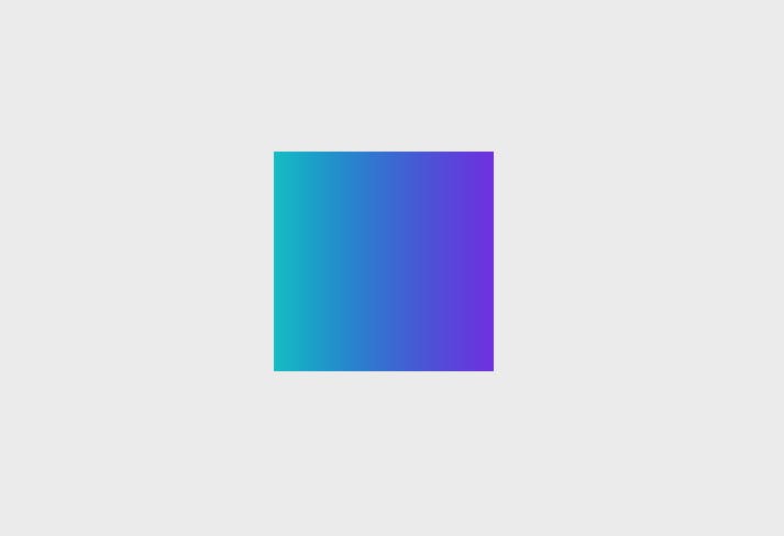
Square
First thing first, let's create a square. Starting with a square because circle and square have similar properties to give it a shape with one minor difference for circle. To create a square you create a div in HTML give it an id attribute of the name square and in the CSS part select that id with a CSS selector £ which is used to select an id in CSS. Now we will give the id similar width and height so that it can take the shape of a square. Now we will add a border to the square id. We will give borders to all four sides of the square. And voila your square is created.
HTML
<body>
  <div class="container">
    <div id="square"></div>
  </div>
</body>
CSS
#square{
  width:  200px;
  height:  200px;
  background: linear-gradient(90deg,#00c4cc,#7d2ae8);
}
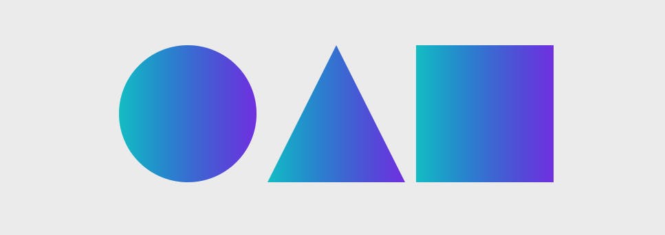
Combining it all
Let's add up everything together so now it should fall beside each other and your squid game symbols are ready. We have reused the CSS styles for circle, triangle, and square. We have also added a new class for giving margin to all three symbols. Reusing CSS makes your CSS file smaller and faster to ship over the network.
HTML
<body>
  <div class="container">
    <div id="circle" class="m-8"></div>
    <div id="triangle" class="m-8"></div>
    <div id="square" class="m-8"></div>
  </div>
</body>
CSS
body {
  width: 100vw;
  height: 100vh;
  background: #eee;
}

.container {
  width: 100%;
  height: 100%;
  display: flex;
  justify-content: center;
  align-items: center;
}

.m-8 {
  margin: 8px;
}

#circle, #square, #triangle {
  width: 200px;
  height: 200px;
  background: linear-gradient(90deg,#00c4cc,#7d2ae8);
}

#circle{
  border-radius: 50%;
}

#triangle {
  clip-path: polygon(50% 0%, 0% 100%, 100% 100%);
}
Let me give you an idea. Mint this as an NFT. Share your profits with me. :D